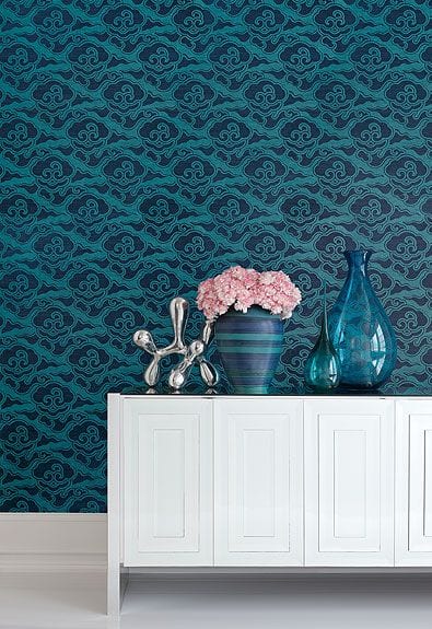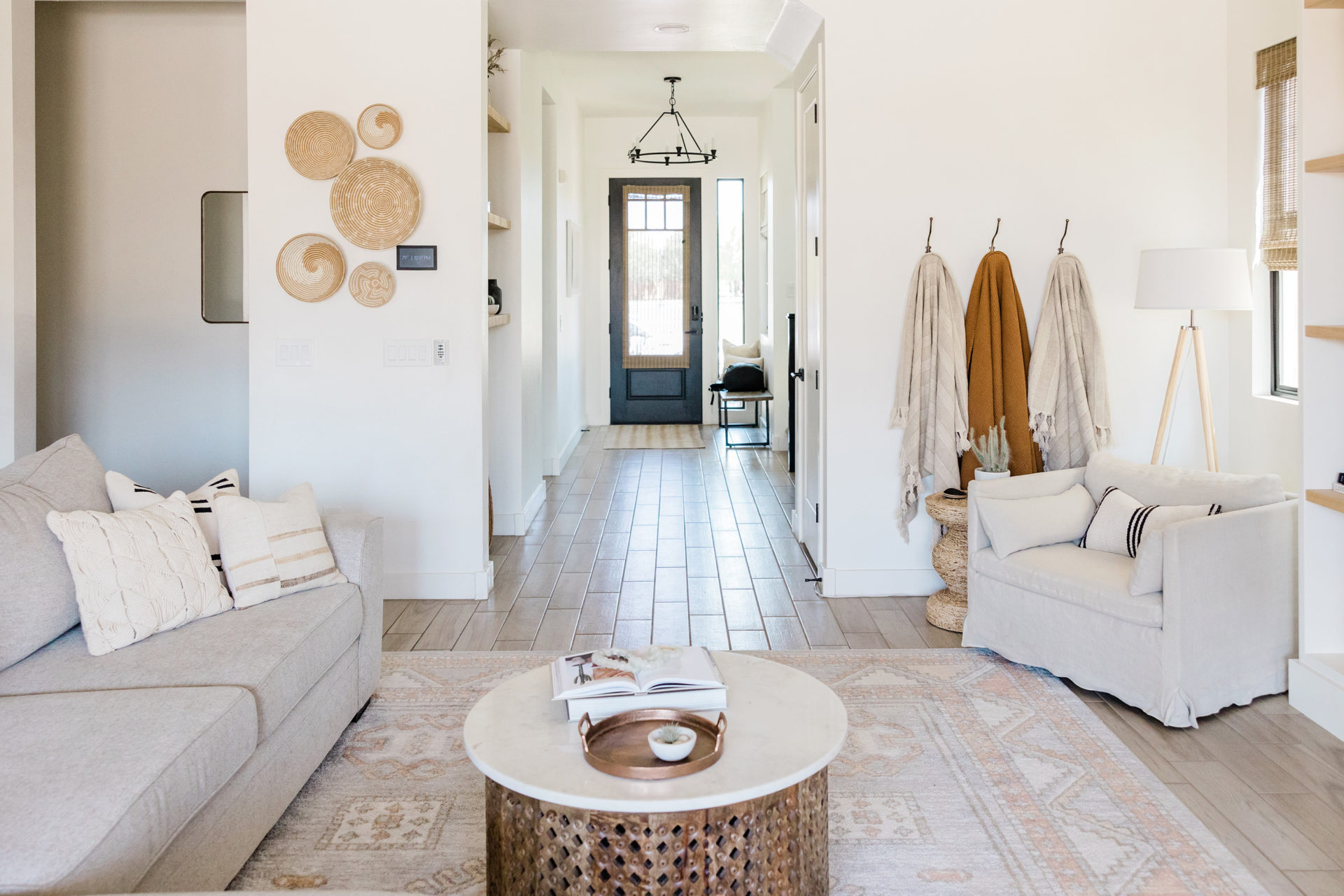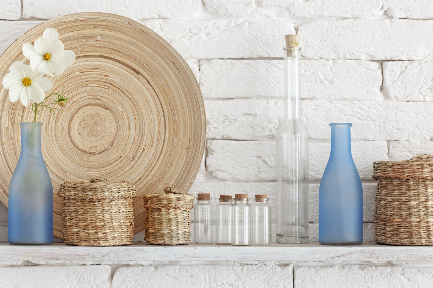
When we stage a home, we’re bringing in furniture and soft goods of course, but did you know that we’re also bringing in and styling accessories? Plants, pillows, pottery!
Why? Because the goal of staging is creating a space that feels homey and loved. Little touches that show warmth and personality provide this to the home.
If you’re getting your own space ready for sale (or maybe just for YOU), here are a few pro tricks to get you started.
Tip #1: Group Items Based on Color, Texture, and Shape
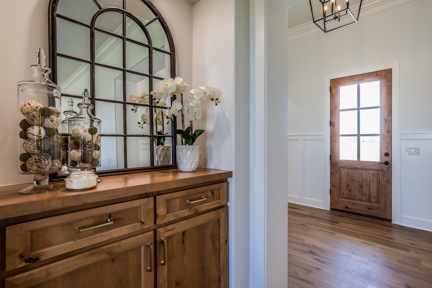
A grouping can be a trio or collection of like items- three different sized vases or candlesticks, for example. But it need not be the expected!
The human eye prefers to see things in odd numbers (barring perfect symmetry – see below). Three or five items grouped together are the most pleasing to look at. The set can match, but think outside the box a bit and group items that perhaps RELATE, rather than match.
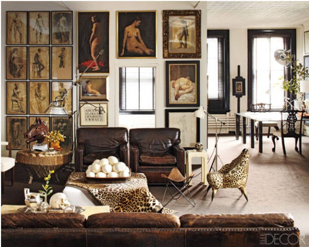
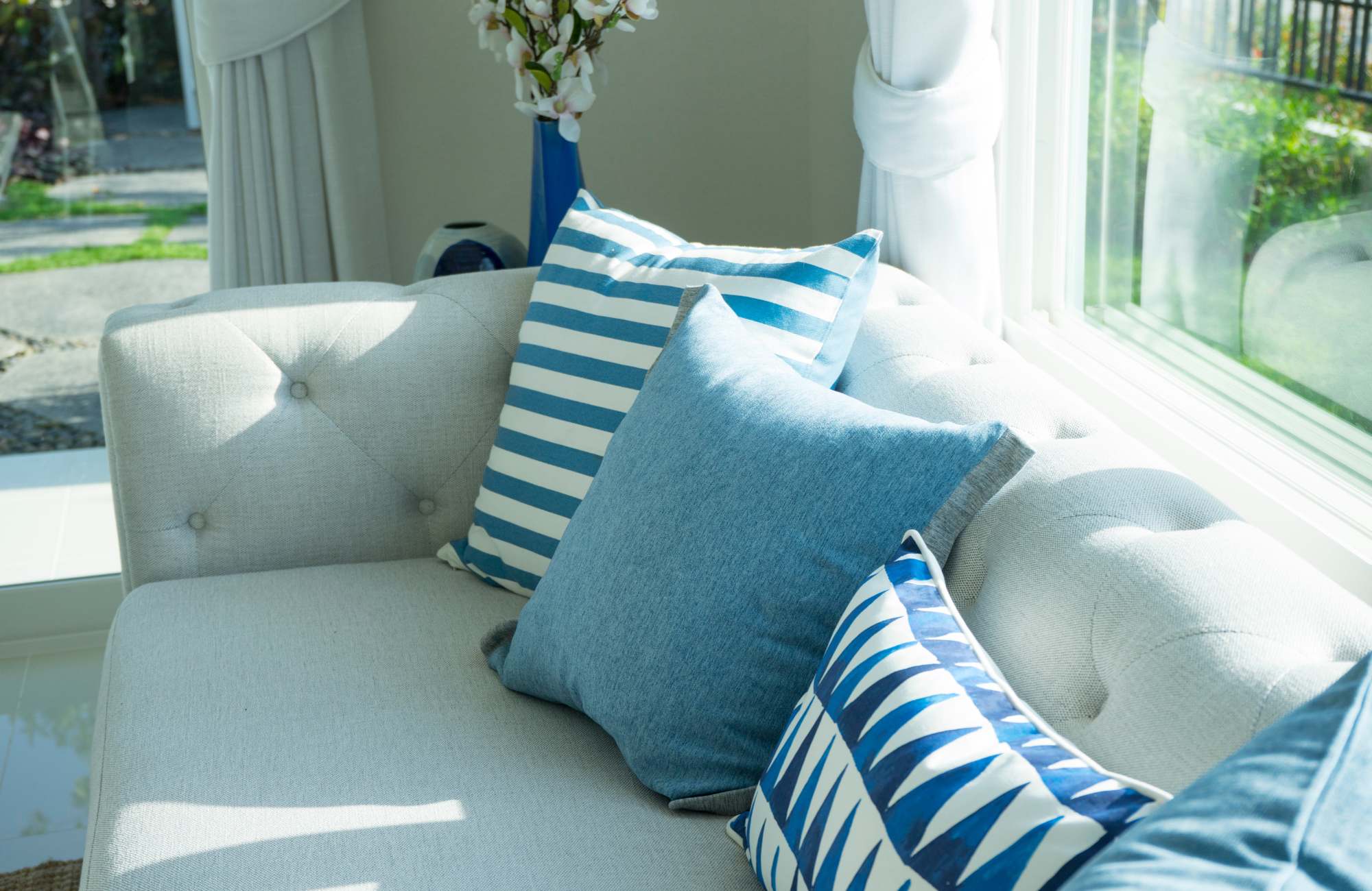
Consider grouping a few items that have the same style but different shapes. Or perhaps choose items for a combination of textures and colors that play nicely within your color palette. Check out some of the images to get inspired.
And don’t be afraid of empty, or negative, space. Picture a pair of lamps on opposite ends of a console table with a jauntily placed grouping sitting next to only one of the lamps. The rest of the space is left open to breathe…ahhhh! So nice.
A grouping of three on one side and NOTHING across? No problem! This is a classy solution to styling accessories that is also simple – nothing is needed to balance it!
Tip #2: Mix Item Heights to Spark Interest
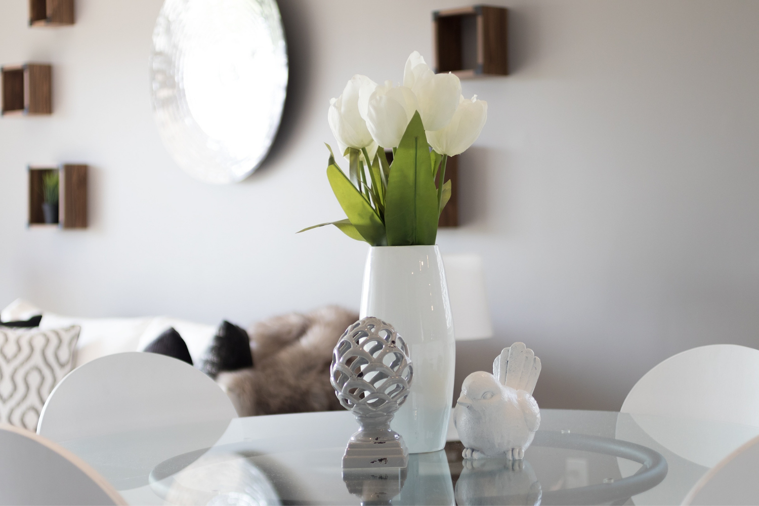
When you’re thinking about a trio of items, don’t forget to mix up your heights! It is kind of boring to have everything on the same level.
Going big scale is another great trick for making a bold statement. A trio of three larger scale items can fill a space in a much cleaner way than a counter full of knick-knacks (which will look like clutter in staging photographs). A collection of many small items may also encourage your family to add more to it, ruining your curated look.
Tip #3: Bring Balance Intentionally
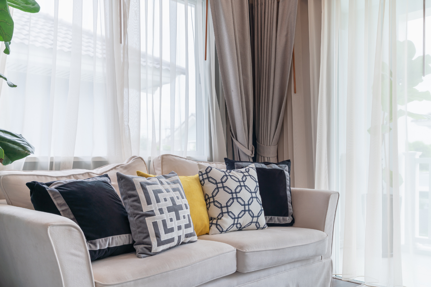
While asymmetrical arrangements are great and eye-pleasing, there is something to be said for inserting a little symmetry into your space. Symmetry adds order and rhythm, so if your furniture is random and mismatched, it might be helpful to use accessories for some much needed balance!
A console behind a sofa or against a wall in the foyer could be just the ticket to balancing a lack of cohesive furniture. Add a few colorful throw pillows (evenly spaced and matching color) to the mismatched furniture, and you’ll be surprised how quickly you can balance a room.
If you are interested in styling your surfaces for ultimate beauty, let’s chat! Our design expertise is just what you need.
Xoxo,
Pamela


