Decorating with green? Is green your favorite color?
Green is a perennial favorite in design. Whether you’re looking at a sassy apple green, a rich forest green or cheery kelly green, you’ve got lots of options for lots of moods. When I first moved into our current home, (which I call here in my blog the “SoCal Whitehouse”) the ONLY room I painted before loading in was the pantry. WHY? Well, I knew I wasn’t going to green anywhere else, but I wanted something bright and fun. Also, I didn’t know WHAT I wanted to do, but figured if I didn’t paint it before it got loaded with food, I never would. Besides, it was nasty. Everything else in the house had received a fresh coat of paint prior to it going on the market, but NOT the pantry. Ewwww… So out came the paint. A bright and fun and sassy Apple Green.
GREEN – You are stable, fastidious, kind, generous, caring, intelligent, love food and easily understand new concepts. You are usually loyal.
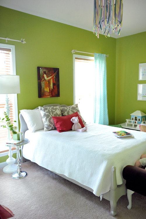
♥Here’s our Sassy Apple green. Fun stuff.
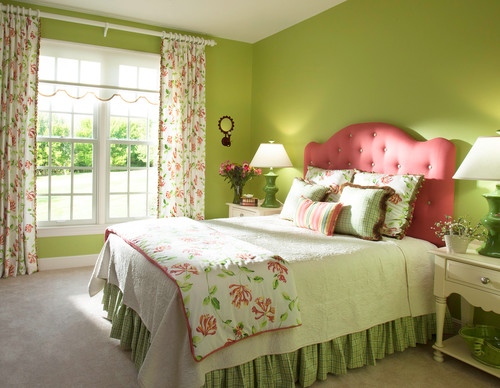
Traditional Bedroom by San Diego Interior Designers & Decorators Decorating Den Interiors – Susan Sutherlin
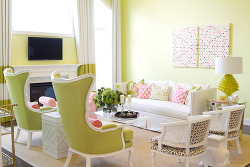
♥Always gotta throw in a picture with our featured colored (green) and MY favorite color (pink).
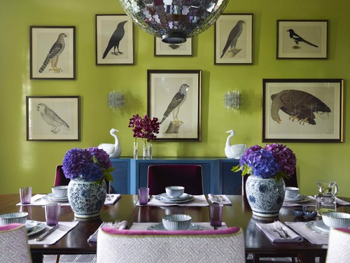
♥By Far, my favorite room of the month. Green and Turquoise and Purple and traditional bird prints. Throw in a wild chandelier, hydrangeas and pink velvet trim on the chairs?? Holy Moly!
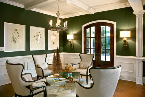
♥Now to tone it down. This very elegant room features a luster-rich wainscoting and a forest green that is just toned down enough to not feel like the 80’s wants their hue back!
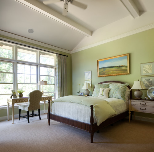
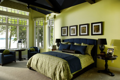
♥This shade of green is soothing and restful…perfect for a bedroom. This shade can feel a little bit like a hospital hue but is kept from that here with soft carpeting, beautiful art and a great ceiling. A lesson – never judge a color until ALL the pieces are in place.
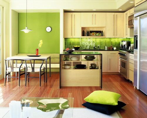
Contemporary Kitchen by Oakland Architects & Building Designers Mercedes Corbell Design + Architecture
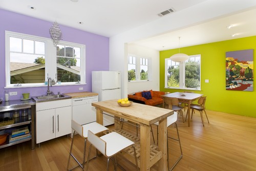
♥I often decorate around an inspiration piece and here it’s done quite literally with the whole palette pulled directly from the art. A fun color play.
♥I love the way the designer married the tile in the kitchen to the wall color in the dining room. It’s almost as if it’s planned that way!?! Try to visualize either of those spaces without the green and it falls flat. It really needs it in both places to balance it.
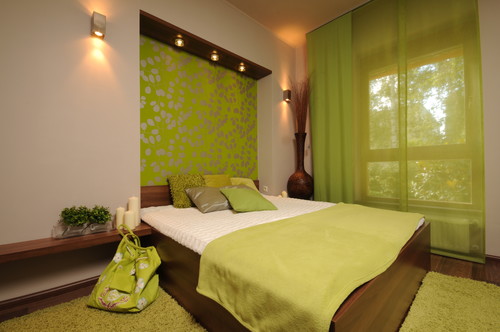
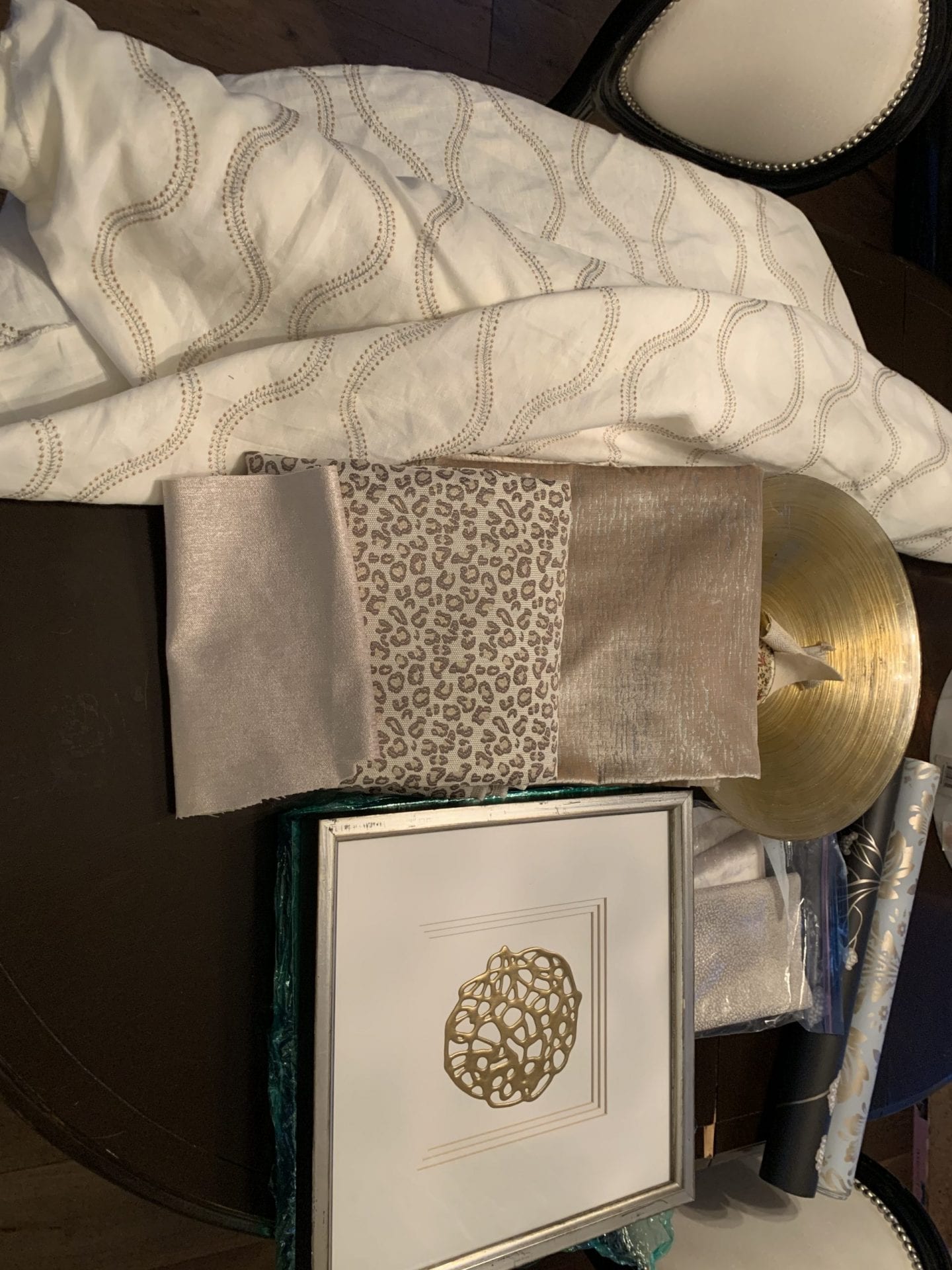
♥So simple, but a lot to take away here. The detail of the drapes is really lovely. Simple but bold at the same time. The wall is covered with a pretty paper accented with foil and the wood keeps it from getting too ethereal.
♥And for a little masculine edge, try adding in Navy blue to your green.
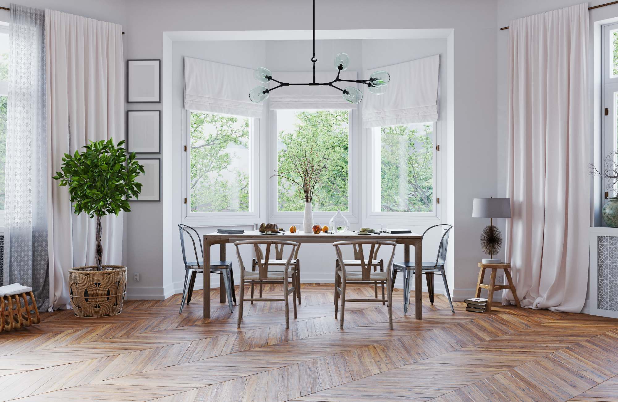
♥So pretty and airy!


