Wallpaper is in. It is everywhere. It doesn’t matter where you look, whether on television, Instagram, in magazines (not just the design variety), or even in real estate listings, wallpaper has made a huge comeback. It’s true what they say— everything old is new again.
So, why do we love wallpaper? This is only one designer’s opinion, but I have plenty of experience, so let’s dig in!
1. Decide to Play it Safe or Go Big and Bold
Most of my design clients play it safe when it comes to wallpaper. Grasscloth or other textures are the top choices. Why? They have a satisfying texture and uniqueness without the bold commitment of a strong pattern.
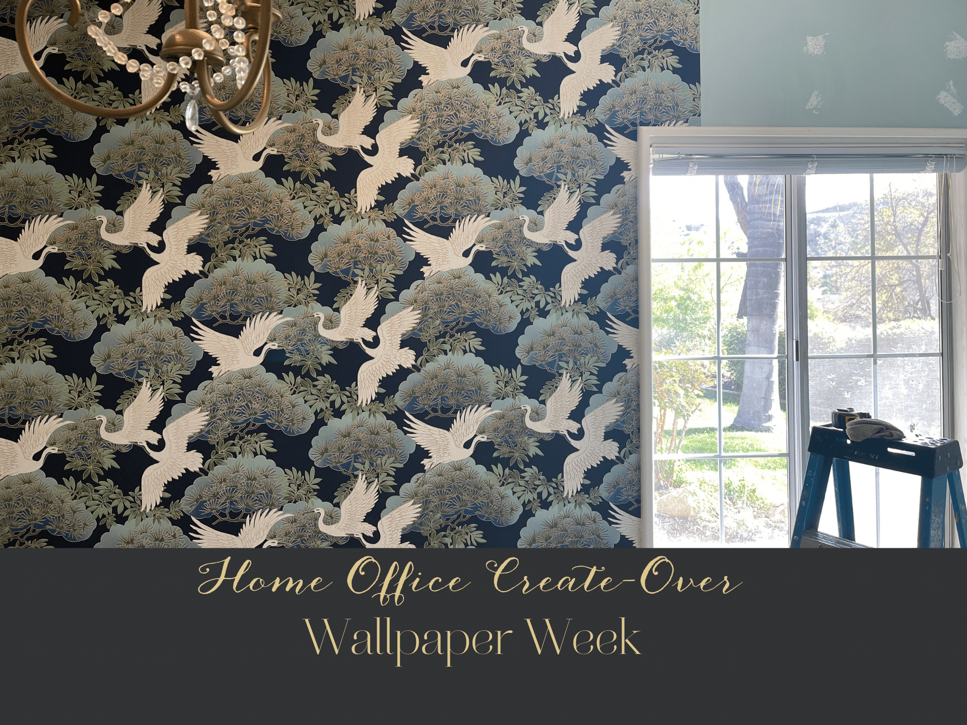
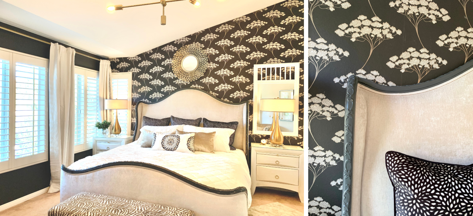
But there’s just no getting away from some of those bold patterns! In full disclosure, I’ve done two rooms in my own home with bold prints, as I do love them. I did them on two walls, only in each space. But what do I love about them? They create the most dramatic bouncing-off point for everything else.
2. Choose a Single Print or Creatively Mix and Match
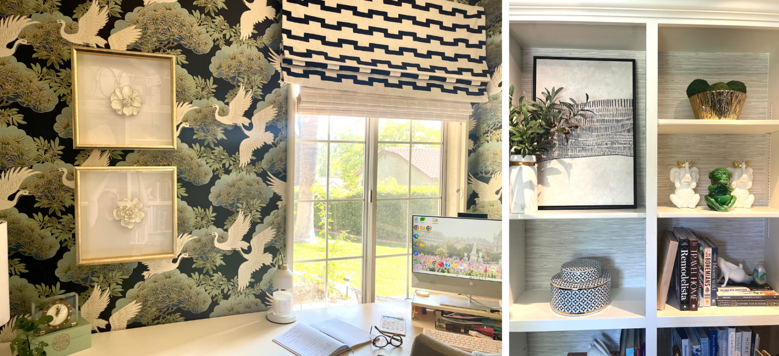
When I designed my home office last year, I mixed and matched two wallpapers. One on two walls and a texture on the walls behind my bookshelves – just for fun! You can also use wallpaper to create cohesion out of an otherwise simple space or to help bring pieces together.
In this client project, we had a wall with electronic components that were dark, and we wanted to minimize the visual weight while also bringing in more of my client’s favorite blue color and ties into the custom Roman shades.
3. Be Adventurous in a Small Space
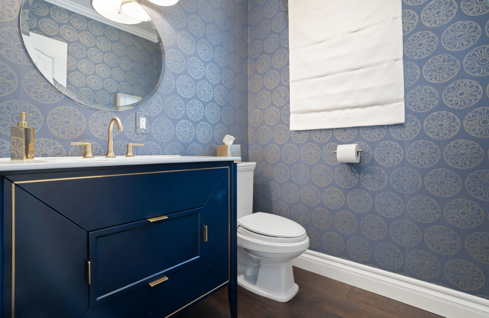
Powder rooms are popular places to have fun with papers! It’s a small space, and often, my clients are willing to experiment in these small spaces! I love this navy vanity with the matching navy and gold wallpaper.
4. Look Beyond the Room’s Walls
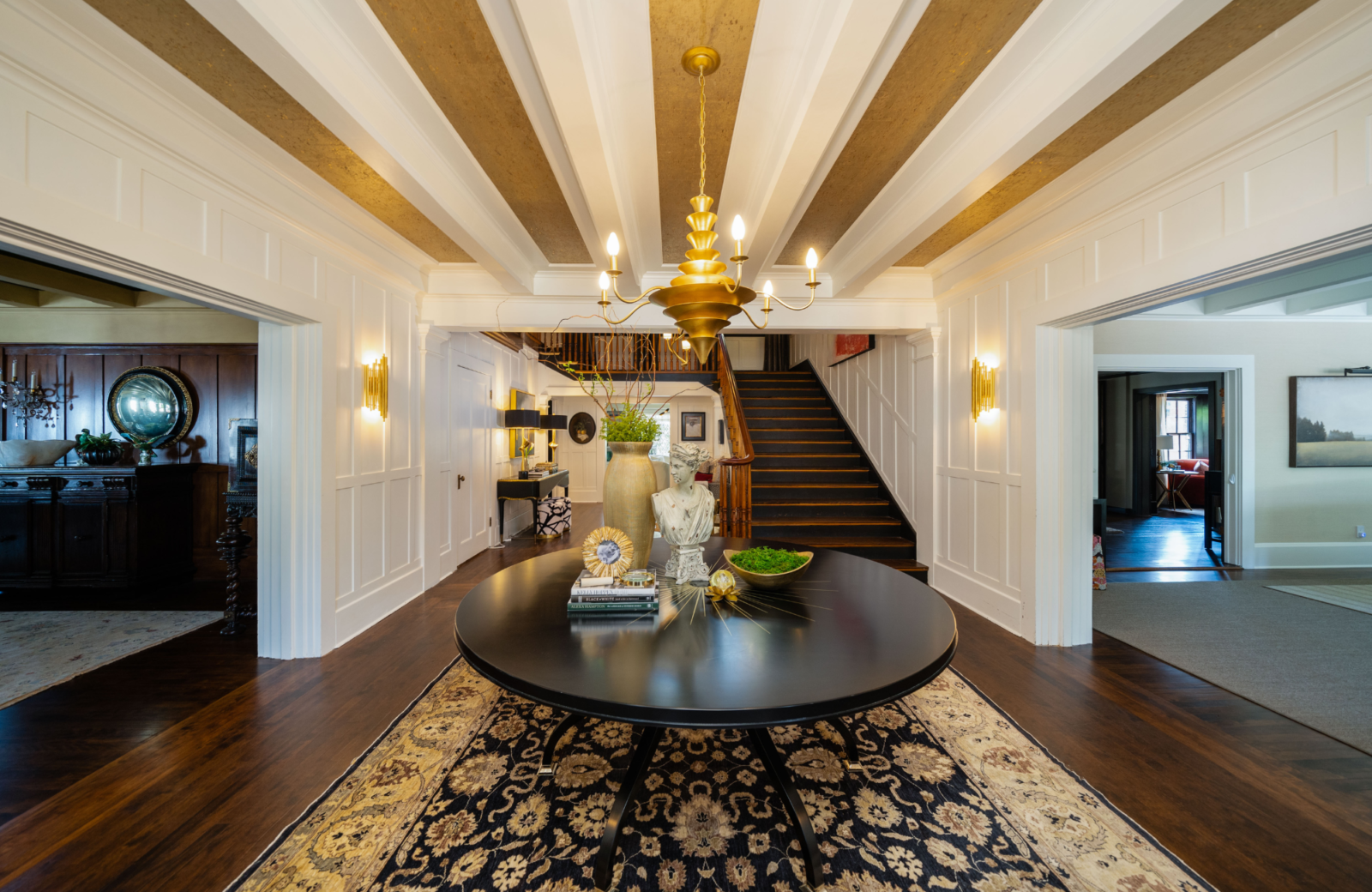
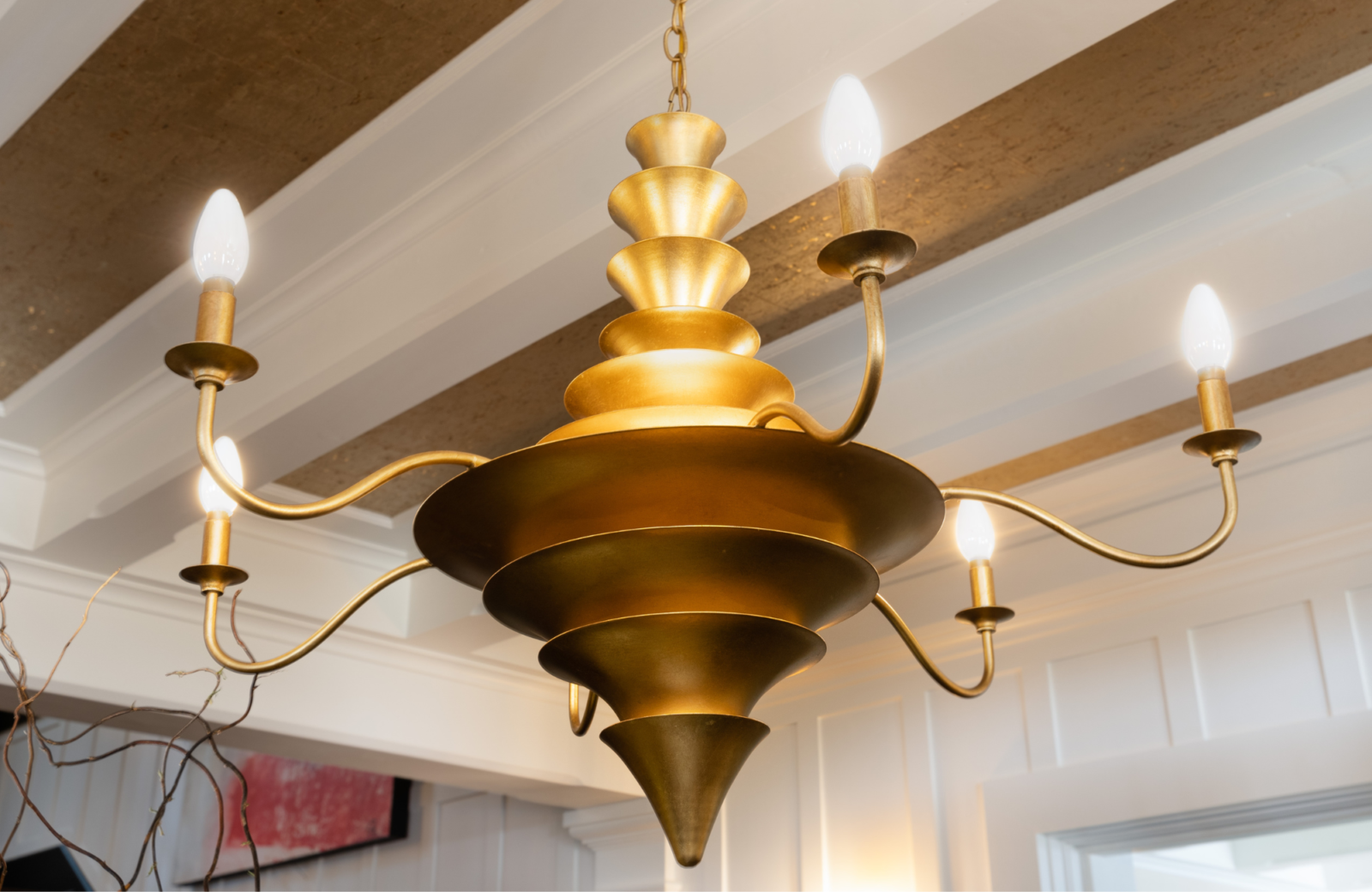
Last year, we participated in the Pasadena Showcase house and used the stunning gold foil cork wallpaper from Thibaut on the ceiling. The glow from the uplight of the chandelier was absolutely incredible!
5. Pair the Paper with Curated Art or Let it Stand Alone
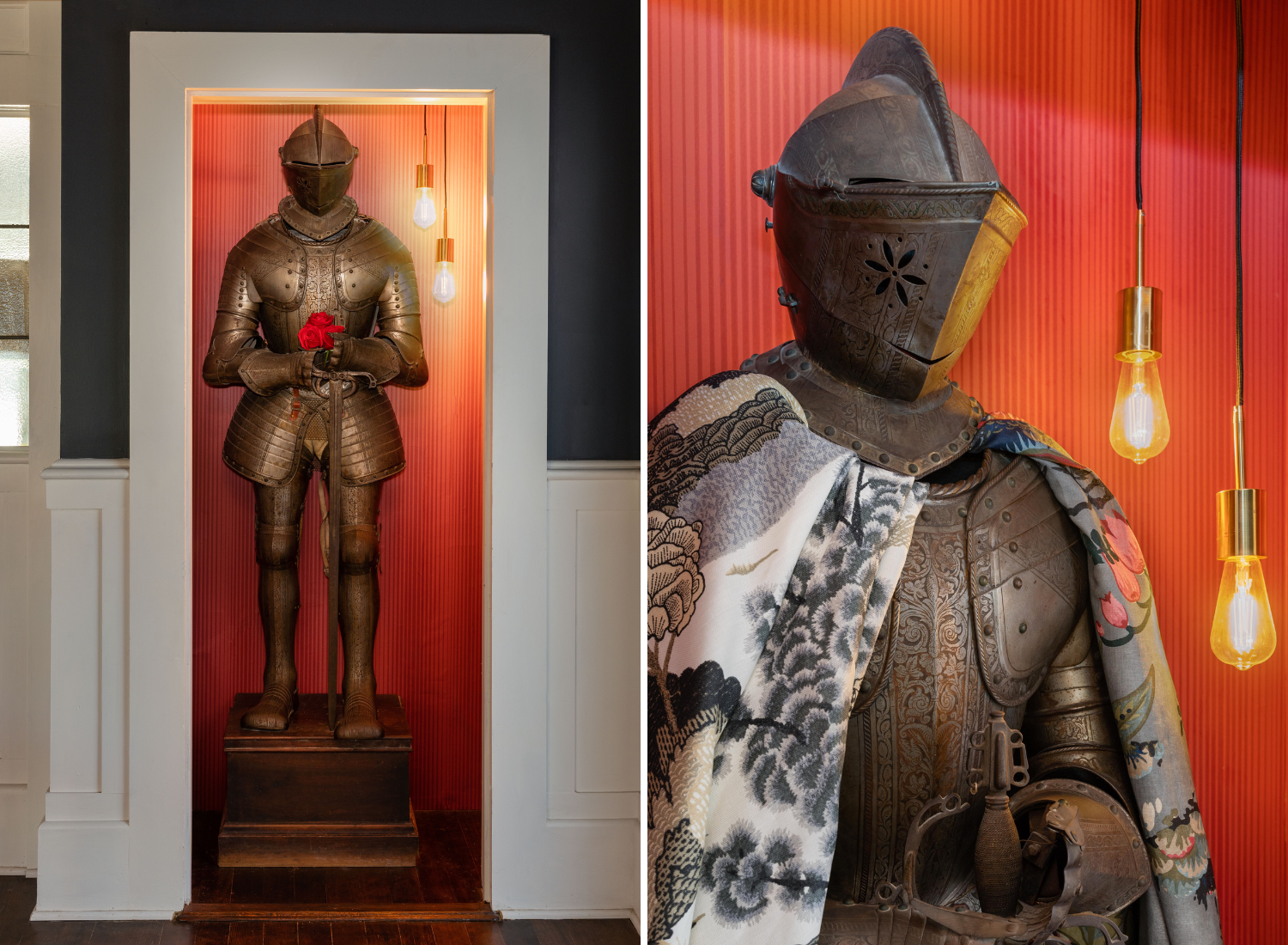
Part of our Pasadena Showcase house featured a full Coat of Arms. The homeowner offered to remove him, but we opted instead to give him his own private quarters! We used this fun and sassy wallpaper, also from Thibaut, to line the closet, lit the space, and placed him inside to supervise the festivities.
You can agree that in these more unique settings, the wallpaper is the star of the show. Simple paint would never accomplish quite the style you get from the pattern and texture of a unique paper.
Need help choosing wallpaper that works with your furniture, decor, and personal aesthetic? We’re here to help! Give us a call.
Xoxo,
Pamela


